
Hello friends~ I've been working outside in the gardens when the sun is shining, but it rained all day yesterday, giving me the chance to play with paper flowers in my craft room. So, I'm popping in with a trio of cards I made using the colors Coral and Teal, from Color Hues Challenge.
I don't know what the trick is to getting "real" color when photographing cards. The coral colors look more orangey to me and the teal almost takes on a forest green color. At any rate, they really are coral and teal colors.

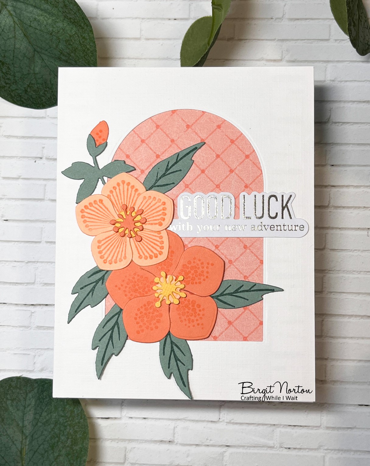
I cut the arch using Scrapbook.com Nested Arches and put a piece of printed scrapbooking paper behind. That color seems to display the coral color the best. The Hellebores flowers are from Marianne Designs and the sentiment is a premade foiled sentiment from Pinkfresh Studio.

Since I cut out many flowers and leaves, I went on to make two more cards.

Happily using up more of that printed paper and some of the Pinkfresh sentiments.

I have a few flower gardens in my yard, but never have I grown Hellebore. They're a super early spring flowering perennial. I may just need to find space for them. Until then, I'll enjoy making them with paper!
I'll be adding one of these cards to the following challenges:
Color Hues ~ Coral & Teal

Cut It Up ~ Send Me Flowers
Word Art Wednesday ~ Anything Goes
Thanks for stopping by!

13 comments:
A trio of prettiness Birgit! We had a rainy Saturday too. Paper flowers are always the way to go on gloomy days like that!
Like you, I find photographing certain colors very difficult . . . and frustrating. Regardless, your three cards are wonderful! The subtle design changes worked really well. I'm a huge fan of helebores; we have several of them, but they bloom here before it's warm enough to be outside to enjoy them. Yours are much more adaptable! Thanks so much for joining us at Color Hues!
Your trio of Hellebores are so pretty Birgit and the perfect way to bring color into your craft room on a rainy day! And I hear you about photographing color and it looking completely different than the actual color you used...grrrrr! My teal didn't turn out like it really is either, so no worries! We don't get too hung up on the hues here at the challenge, and I personally think your trio of cards match up beautifully, and we're thrilled that you shared with us here at The Color Hues Challenge!! Hugs. :0)
Well, you certainly had a productive day in the craft room, Birgit! I love the hues of your cards and the arched backdrop. I think if we all could master the photography part of this hobby we would feel as if we won the lottery. I think your photos look great. Thanks for playing along at Color Hues.
Photography can be frustrating, especially with certain colors. It can be hard to get a match, even with ott lights and editing, grrrr. However, nothing detracts from the beauty of your cards, Birgit. These would be lovely in any color. As a group they're especially pleasing. I love the arch.
I'm sorry, Birgit, about your teal - how beautiful these must in real life!
I would love to have Hellebores in my garden - I wonder if they'd be fussy like Hollyhocks?
=]
First, I LOVE the name of your blog!! What a great concept; crafting while waiting on Him!! Love it!
Your cards are all so pretty!! I love how it looks like there is stitching detail on some of the flowers; it really adds a great touch! Thanks for playing with Cut It Up Challenge.
Gorgeous card. LOVE the beautiful colors and flowers
Hehehe, I have the same problem when photographing my cards. Maybe you and I should team up and do some photography classes? It woudl be fun for sure. Your set of cards is gorgeous, even if you couldn't quite capture the correct hues. Love the bold sentiments you used on this lovely card design.
Lena xx
I agree with what's been said before, this is a fab trio of coral and teal inspired cards Birgit. If it's not shiny sentiments reflecting the light it's the camera washing out the colours! Thanks for being inspired by the Color Hues colours. :)
Photography is a fickle thing in my experience, especially when there is shine in the design. Your card is amazing!!! I love this design so much. Thanks so much for playing with my color combo here at Color Hues!
Well if you can't be out in the flowers the next best thing is to make beautiful flowers :) Love them with the arch opening.
I have the same problem when photographing my cards, but for some reason when I take a side view up close picture the colors seem to be right on about 95% of the time
Hi Birgit! I love your beautiful card and I think the colors looks just right! Thanks for playing at Color Hues!
Post a Comment